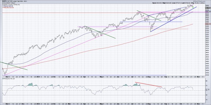
**1. Bar Chart Analysis**
One effective way to visualize the start of a potential distribution phase is by analyzing bar charts. Bar charts provide a clear breakdown of the trading activity within specific time intervals, typically displaying the open, high, low, and close prices of a security over a given period. By examining bar charts, traders can identify patterns and trends that may indicate the beginning of a distribution phase. Look for patterns such as decreasing highs and increasing lows, which could suggest that demand is weakening and supply is starting to dominate the market.
Furthermore, pay attention to the volume associated with each price bar. An increase in volume during a potential distribution phase may signal that a larger number of market participants are actively selling, supporting the idea that the security is being distributed. By closely analyzing bar charts and volume trends, traders can gain valuable insights into the early stages of a distribution phase.
**2. Volume Profile Analysis**
Another method to visualize the start of a potential distribution phase is through volume profile analysis. Volume profile is a graphical representation of the volume traded at each price level over a specified period. By plotting volume profiles, traders can identify significant price levels where large amounts of trading activity have occurred. During the start of a distribution phase, traders may observe increased trading volume at key resistance levels, indicating strong selling pressure and potential distribution by smart money investors.
Additionally, volume profile analysis can help traders identify the development of value areas, which represent price ranges where the majority of trading activity takes place. By monitoring volume distribution within these value areas, traders can gauge the balance of supply and demand in the market and anticipate potential distribution phases. Utilizing volume profile analysis alongside other technical indicators can provide a comprehensive view of market dynamics and support the identification of distribution phases.
**3. Point and Figure Chart Analysis**
Point and Figure charts offer a unique perspective on market trends and can be a valuable tool for visualizing potential distribution phases. Unlike traditional bar or candlestick charts, Point and Figure charts focus solely on price movements, filtering out noise and displaying clear trends in a concise manner. During the early stages of a distribution phase, traders may observe a series of lower highs and lower lows on a Point and Figure chart, indicating a shift in market sentiment from accumulation to distribution.
Additionally, Point and Figure charts use Xs and Os to represent price movements, making it easier for traders to identify critical support and resistance levels. By analyzing the formation of distribution patterns, such as triple tops or descending tops, traders can anticipate potential distribution phases and adjust their trading strategies accordingly. Incorporating Point and Figure chart analysis into technical analysis can enhance traders’ ability to recognize early warning signs of distribution and make informed trading decisions.
In conclusion, visualizing the start of a potential distribution phase requires a combination of technical analysis tools and charting techniques. By utilizing bar charts, volume profile analysis, and Point and Figure charts, traders can enhance their understanding of market dynamics and identify early indications of distribution phases. By staying vigilant and continuously monitoring price movements and volume trends, traders can improve their ability to anticipate distribution phases and adapt their trading strategies for optimal performance.
